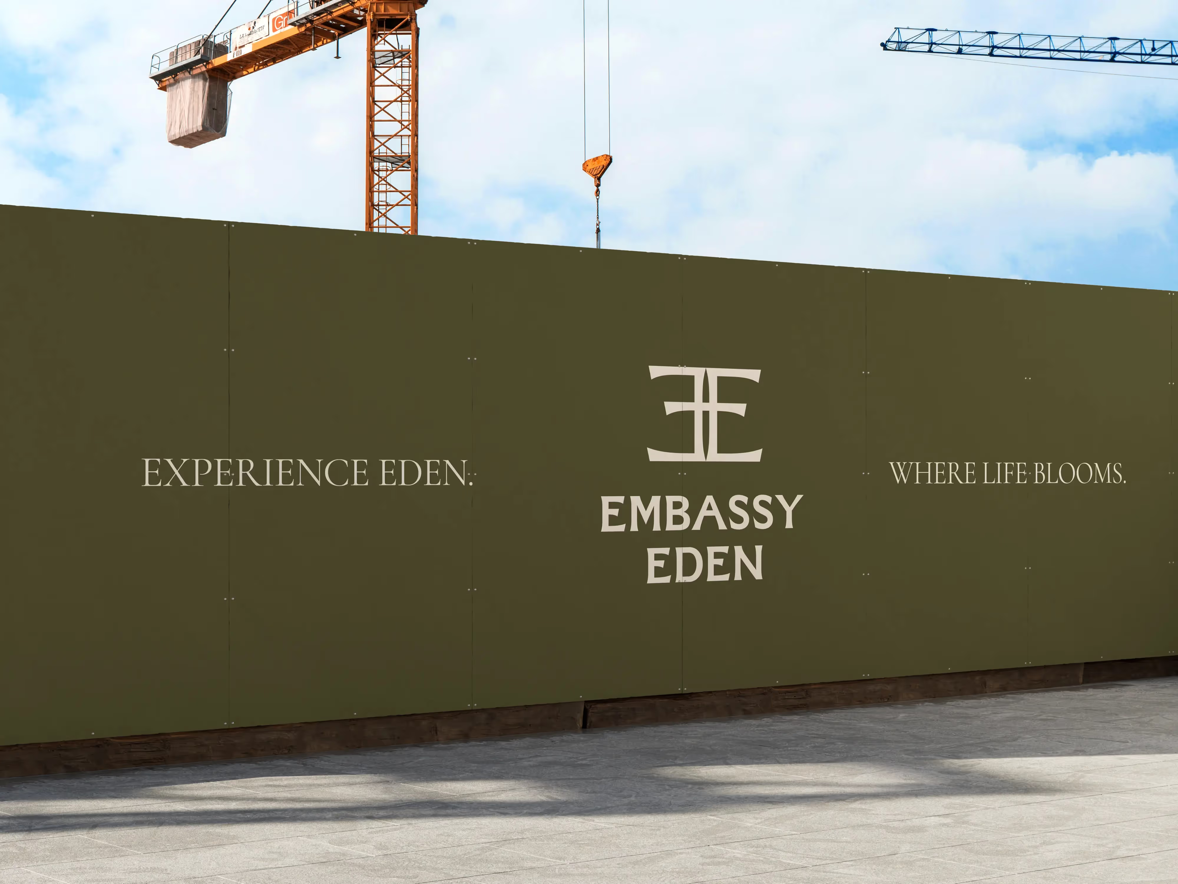
Embassy Eden
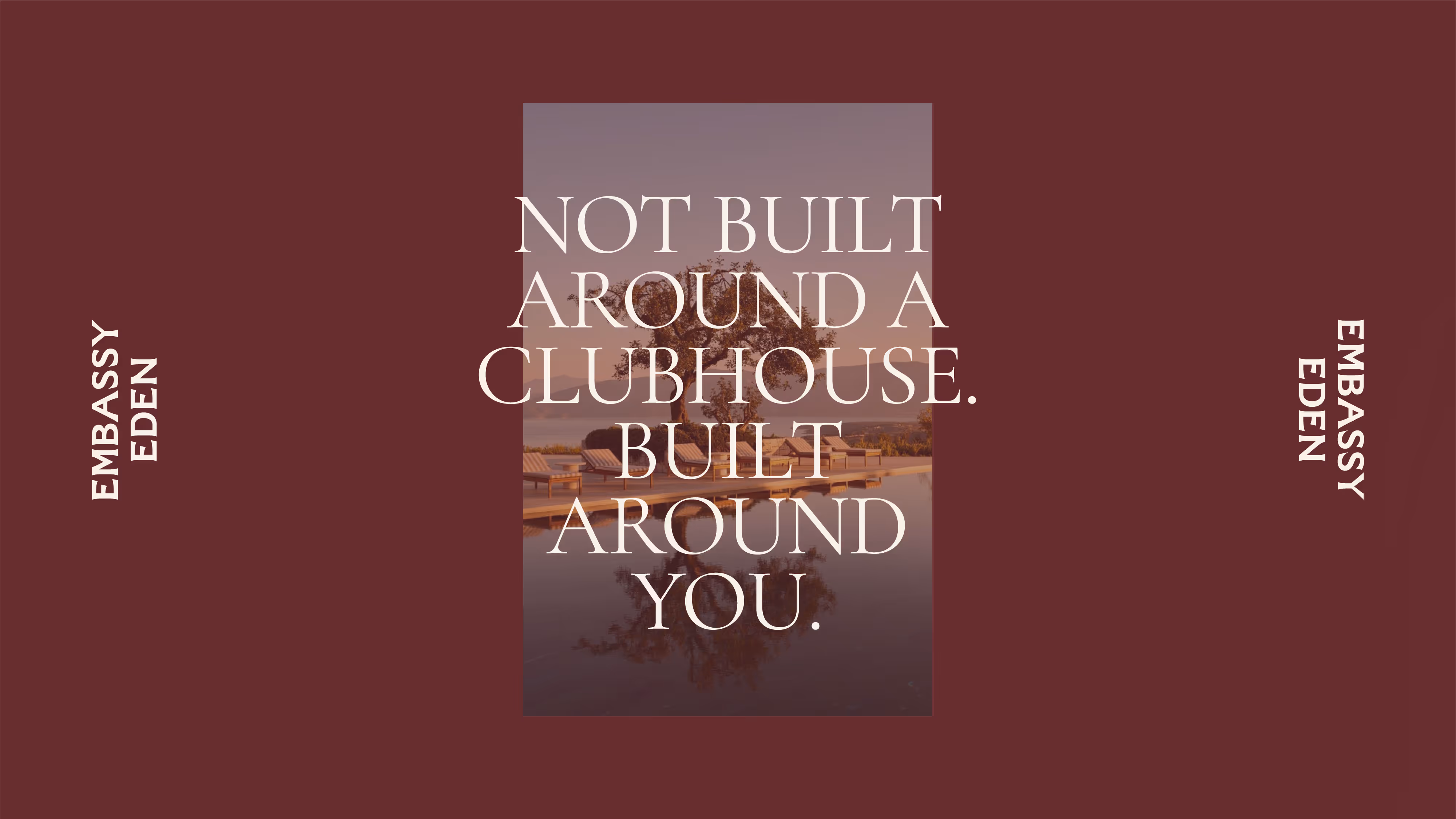
Embassy Eden is the most intimate residential offering yet from the Embassy Group — an ultra-luxury gated villa community in North Bengaluru’s Yelahanka district. With just 95 private residences spread across 30 acres of biophilic design and modern landscaping, Eden was envisioned as a place “built around you, not a clubhouse.” In collaboration with a team of strategists and copywriters, I was brought on to lead the brand identity and visual communication system for this ambitious launch. But unlike other luxury developments, Eden wasn’t about a loud arrival—it was about intentional stillness.
Approach
Before touching a logo, we immersed ourselves in Eden’s lifestyle. Through moodboards, references, and strategy workshops, we anchored the visual system around three guiding principles:
- Quiet luxury over visual noise
- Biophilic warmth over cold minimalism
- Timeless structure over fleeting trends
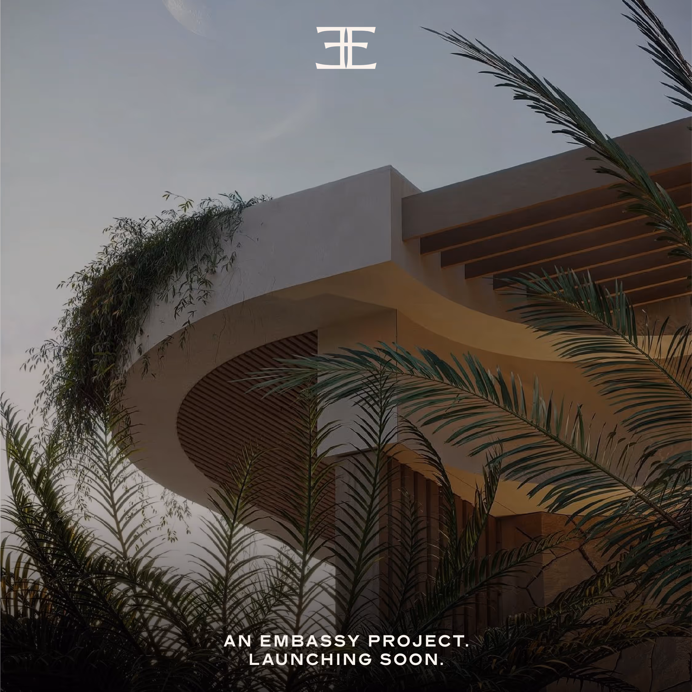
We looked to architectural symmetry, editorial layout systems, natural textures, and tactile palettes.
Identity System
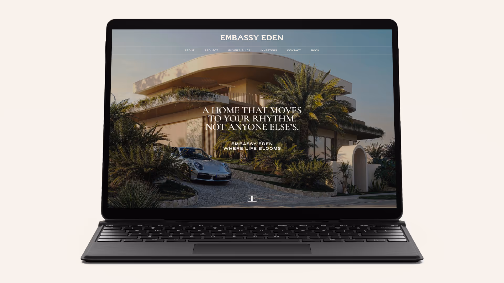
The resulting system is modular, timeless, and flexible:
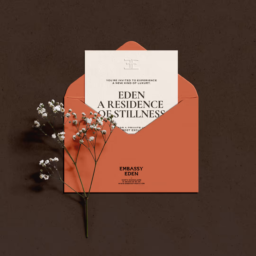
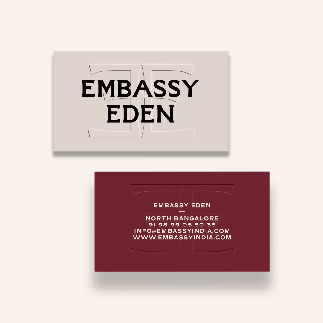
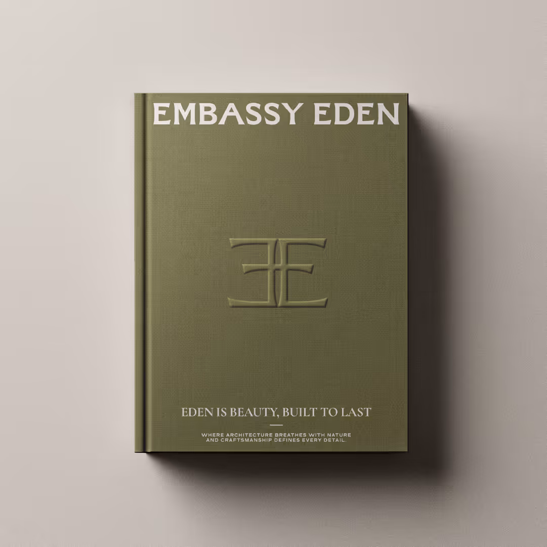
- Wordmark: ‘Embassy Eden’ in equal weight — denoting a balance between brand legacy and the sanctuary it promises
- Monogram: A custom-crafted, mirrored “E” insignia — bold yet understated, designed for both signage and scale
- Combination Mark: Lock-up for formal brand presentation
- Secondary Mark: A stacked typographic system for spatially constrained applications
All designed to feel as at home on a stone plaque as they do on a social tile.
Colour & Typography
The colour palette combines tactile earth tones with calming neutrals. The typography leans on classic serif forms, evoking permanence, while allowing for flexibility across editorial layouts and print.
Together, they form a language that feels crafted, lived-in, and quietly assured.
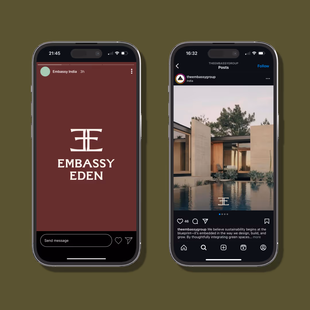
Campaign & Communication
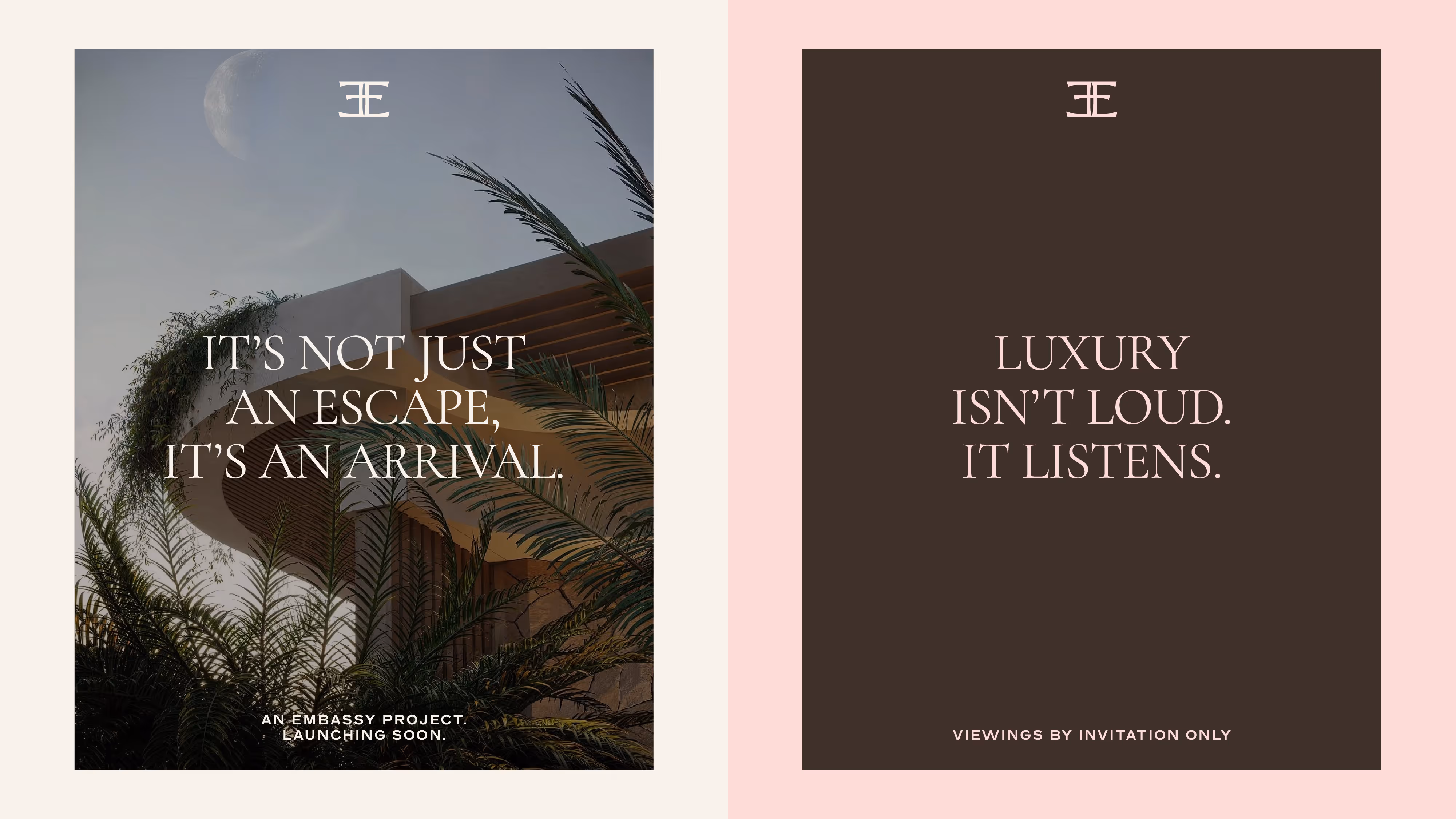
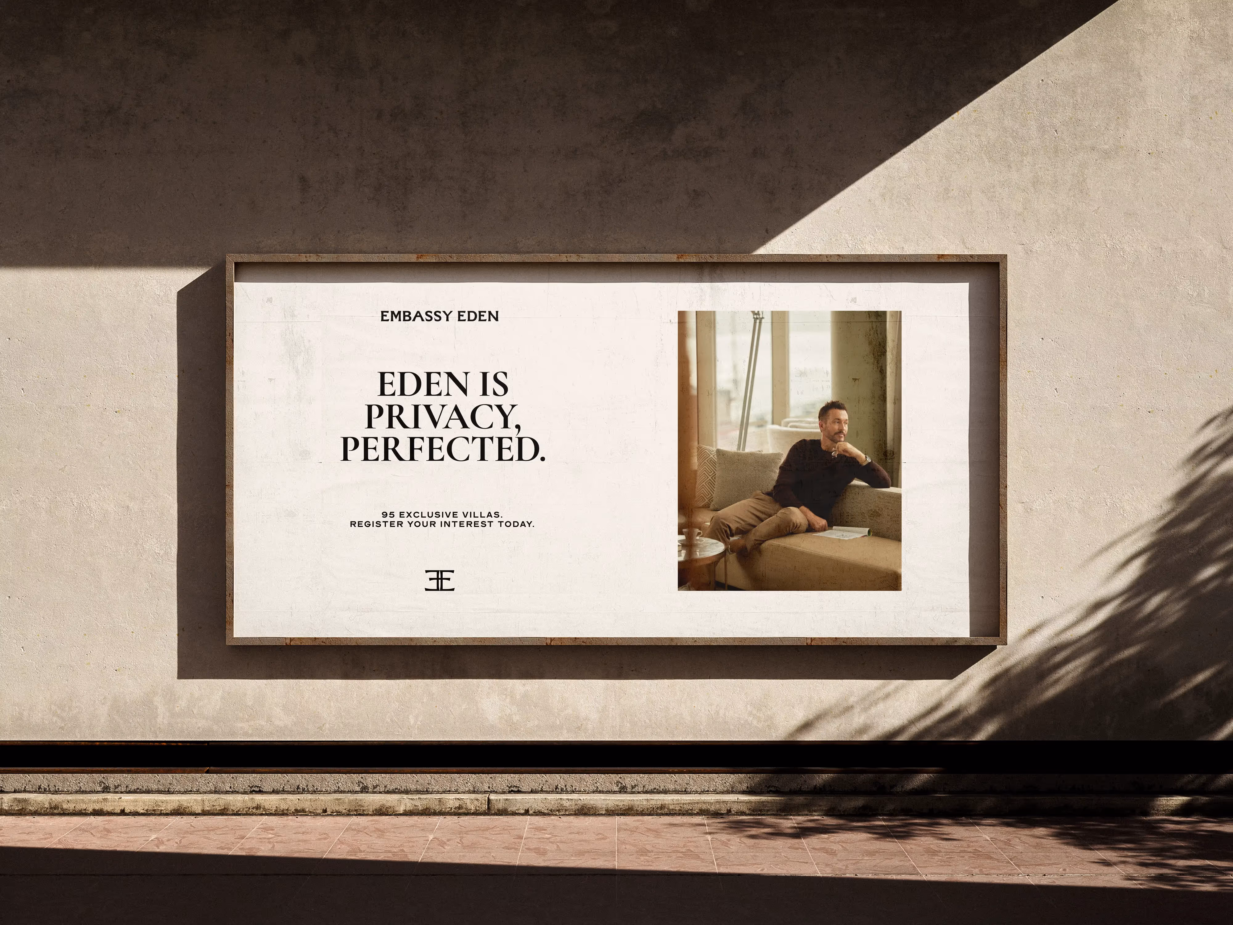
We extended the identity into a phased rollout strategy:
- Teaser Phase: Hoardings and social banners whispered lines like “Stillness, the new status” and “Privacy, the ultimate possession”
- Launch Phase: Print and digital storytelling came alive with ideas like “Eden is beauty, built to last” and “Where life blooms”
Result
The new brand system repositions Embassy Eden as more than a real estate offering — it becomes a lifestyle philosophy. A promise of space, calm, and timeless design.
A place where life doesn’t perform.
It blooms.
Credits
Copywriting Support: Amy Donohue
Agency: NU Branding
Client: Embassy Group
Similar Projects